In my previous article I showed off 14 old CAPTION web site designs. Here’s a little about CAPTION 2012.
Drupal versus Django
I built all the CAPTION sites up to 2008 as static HTML+CSS. Towards the end of that period I was writing most of the copy as well. By 2008 I was feeling a bit burned out on this and for CAPTION 2009 I created a Drupal instance so that the rest of the festival committee could share the burden of writing the words while I concentrated on the typography. That was the theory.
The downside to Drupal is that you pay for the plugability of third-party modules with a styling system that is moderately diabolical. I knew from my experiences on sites like diploma-support.org that trying to change the HTML was an unpredictable mixture of writing specially named PHP functions and editing specially named PHP files. For the sites Drupal is intended for this is fine: the work taken setting up the site is dwarfed by the ongoing work of creating content. For CAPTION, with relatively little content and an ambition to radically redesign the site each year, Drupal was too much work to restyle for this volunteer. (I should stress that I was using Drupal 6; the current version 7 and upcoming version 8 will no doubt have fixed some of the problems I experienced.)
So I created the CAPTION 2012 site from scratch in Django. For me and my
purposes, this was a better fit. First, I get to write all my HTML from
scratch in logic-free templates, which makes it easier to create clean HTML
and sane CSS. Second, since a Django site creates its own models, I could have
separate Article and Info models, the latter being for stuff like venue
information, which can be shared between events. Third, customization is
all in code, and not a mixture of code and fiddling with well-intentioned web
forms. For me that’s an advantage; your mileage may vary!
Structure
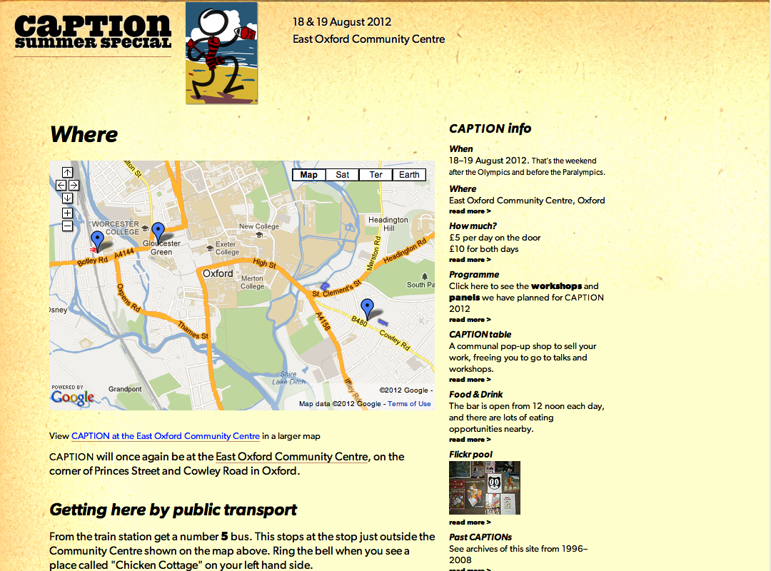
The basic division of the content for one year’s event is articles (news posts and the like) and infos (used for things like the venue and pricing, that are not news).
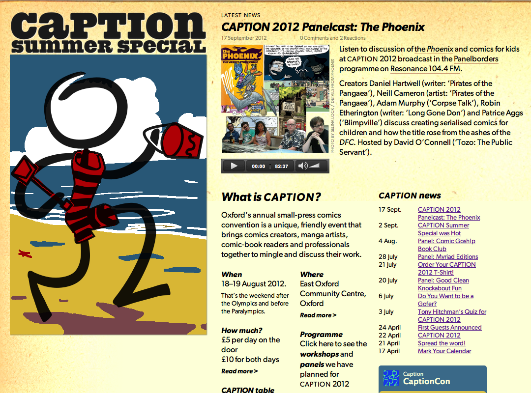
On the main page for the event, shown above, the most recent article is shown at the top of the page, and there is a list of recent articles. The infos make up the ‘What is Caption’ section, where they act as bullet-points outlining what CAPTION is about. Most of them link to a page that expands on the topic—for example, the venue page has the map and detailed directions.
Articles have optional fields for showing embedded media. I added these when we started linking to Alex Fitch’s Panelborders podcasts. Another difference is that articles have comments and infos do not.
Layout
As is my wont I have based most of the layout on a grid of 80-pixel horizontal
units (see 960.gs for a discussion and Khoi Vinh’s site for a
better example). I don’t use a special CSS framework for this, just simple-
minded combination of float:left and box widths that are multiples of 80
minus the occasional 20px for gutters. One trick I use to help keep things
straight is to mostly use margins on the contents of columns to create the
gutter.
I have attempted to make the layout respond sensibly to the width of the display (see the [media queries][12] site for more interesting examples). Some CSS frameworks do this by changing the width of a unit in the typographical grid; I prefer instead to change the number of units allocated to sections of the page. This combined with the float-based layout generally means the page will jump between different layouts as the screen size changes (if you happen to be one of those old-fashioned people who reads web pages on a desktop of laptop, you can see this by changing the width of the window and watching the parts of the page bounce around). It took a little fiddling about with back- of-envelope calculations to get it to mostly form tidy arrangements.
Style
The theme this year was ‘Summer Special’, from which I took the idea of those annuals and fat books of comics and stories they used to have in the olden days, with hardbound covers with litho illustrations and pulp paper inside.
I got the paper textures used in the background by scanning the endpapers of my late father’s Complete works of Shakespeare.


The fonts used, Gibson and Spade Round are about 100 years too young to have appeared in a real summer annual, but I liked them anyway. Gibson has enough of the flavour of slightly old-fashioned childrens’ typesetting to pass. I bought both print and web versions, so I could use the same typefaces in the printed programme.
I created the logo from the standard stick-figure logo (which I have recreated in Lineform since the old files were lost) by adding an Edwardian swimming costume and a beach using faux-lithograph colours stolen from a 1935 Skegness is SO Bracing poster. This is supposed to suggest the cover of one of those annuals, which tend to feature the host character at the seaside.
Future
My current plan is to build on this system for CAPTION 2013 when the time comes. I have already added a mechanism for supplying an annual re-styling when I retroactively implemented CAPTIONs 2009–2011.
In the more immediate future I need to turn the front page in to something that works as an index to both the upcoming event (once it actually is upcoming) and the old archives.