Some friends and I started a small comics convention in Oxford called CAPTION a few years ago—so long ago, in fact, that it predates web sites for events like or anything like that. I started created brochure sites for CAPTION from 1998 (though I think that SpaceCAPTION1999 was the first to have a real promotional site). Reading through the old archives it’s interesting seeing the capabilites of web styling—and my facility with them—improving from year to year. So here is a slideshow!
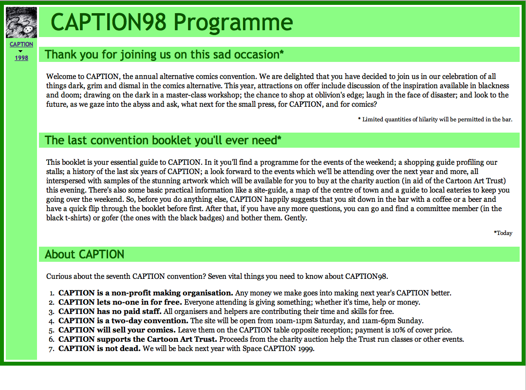
The CAPTION98 styling was very basic but in my defence the support for CSS was very patchy in the late 1990s. For once the sitck-figure logo was not drawn by me.
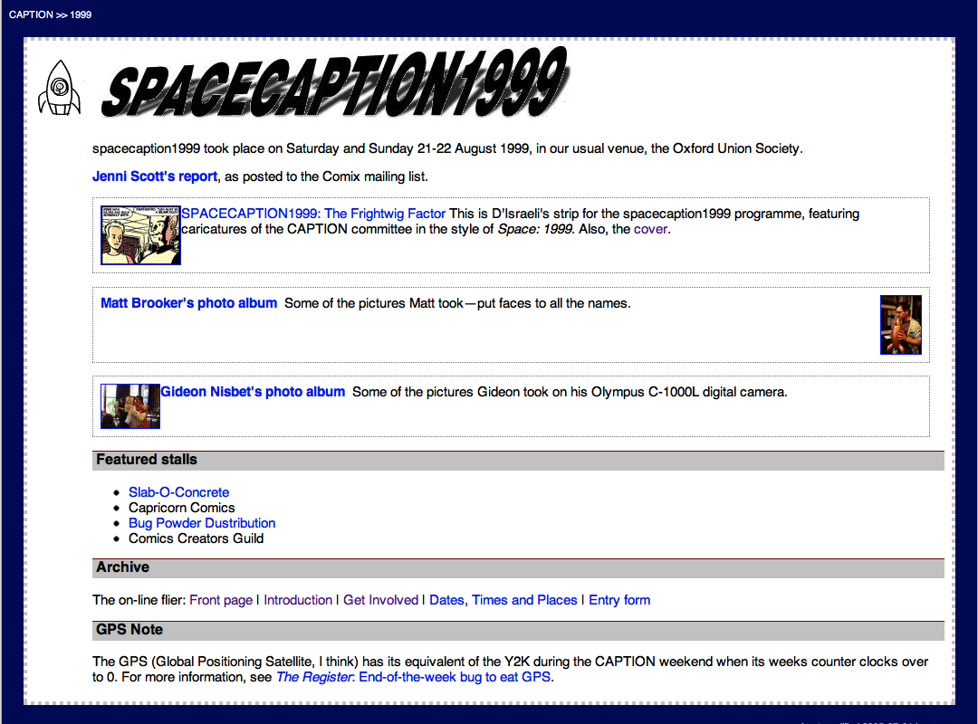
For SpaceCAPTION1999 I added dotted borders everywhere. There were super cute spaceman and alien doodles by Jeremy Day and myself scattered about the flyer, some of which made it to the online version.
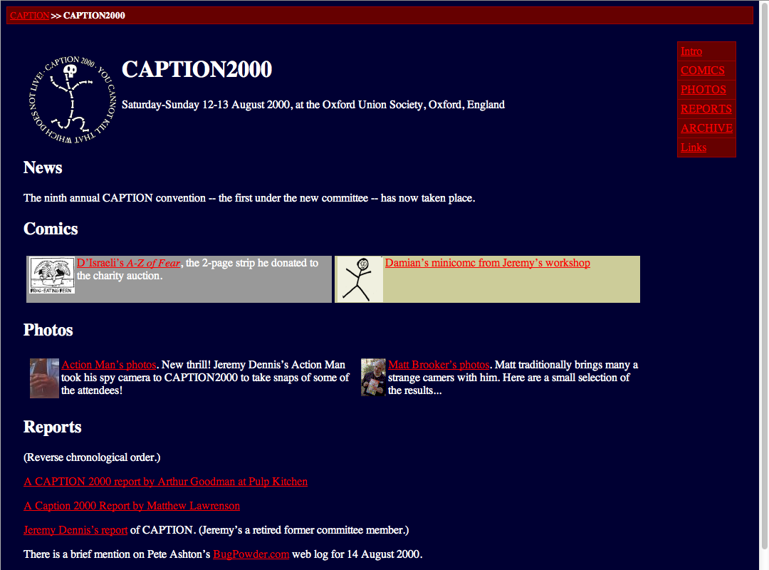
The skeleton stick-figure logo for CAPTION 2000 was by D’Emon D’Raftsman D’Israeli. Red and white on dark blue is how I represent resurrection and renewal apparently.
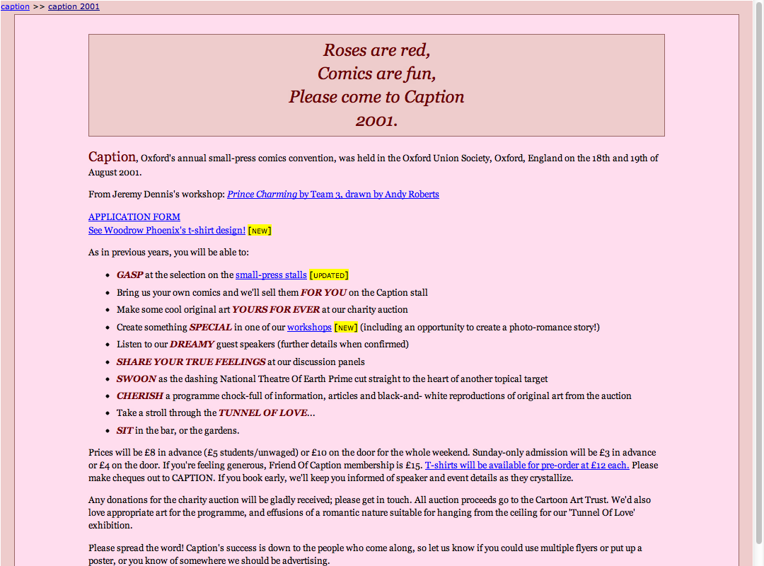
The theme of ‘Love is…’ CAPTION 2001 was romance comics, naturally entailing lots of pink and ITALIC BOLD CAPS.
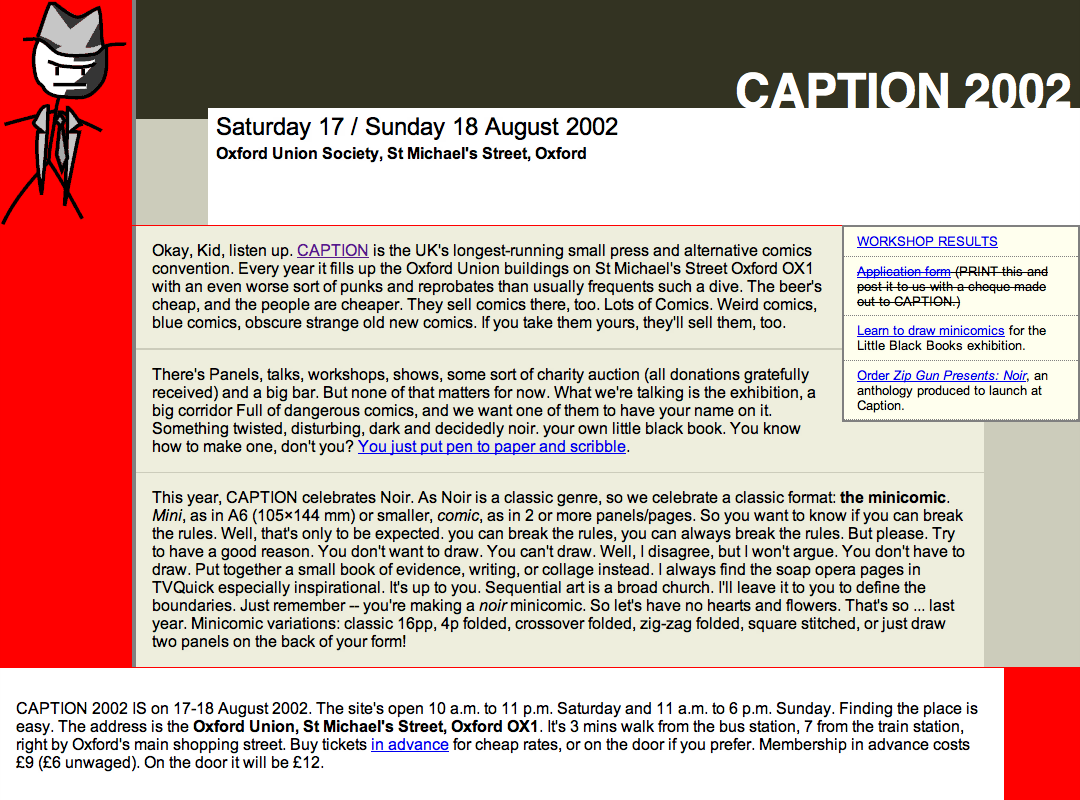
The theme of CAPTION 2002 was noir, so I created a noir version of the CAPTION stick-figure.
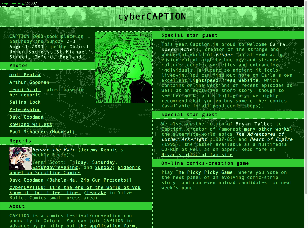
For cyberCAPTION 2003 I created what is still one of my favourite looks. I followed faithfully the convention that to depict the future of computers you imitate computers of the past—the green-on-green screens of 1970s VT-100 terminals, monospace fonts, and all that. The high-tech background is a schematic of the original 1984 Macintosh computer.
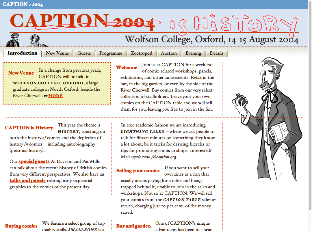
Naturally we followed cyberCAPTION with CAPTION 2004 ‘is History’. I used a mixture of drawings by guests and some copyright-free stock art, plus my best attempt at aping ninteenth-century-style typography on a web page. And those tabs! Using the fashionable-at-the-time sliding-doors technique.
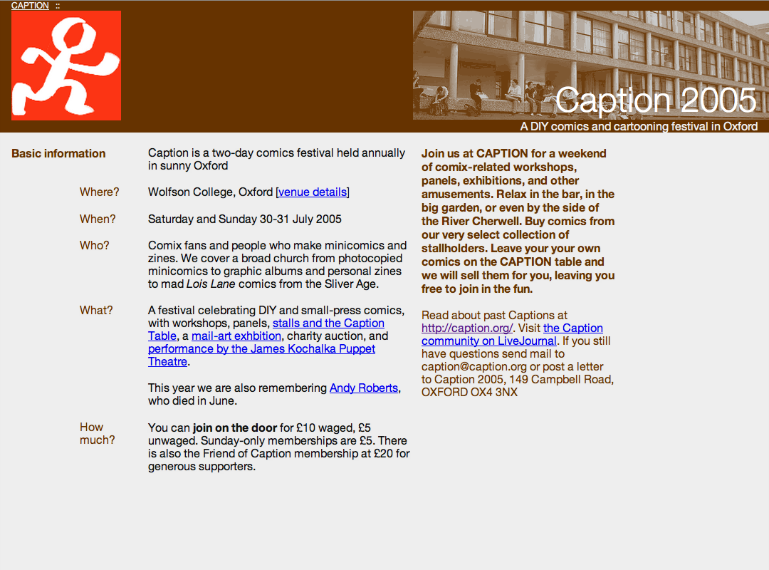
For ‘Bargain Basement’ CAPTION 2005 I went for a minimalist look, all Helvetica and grid-based layouts. The photo is one I took at the same venue the year before. The red version of the stick-figure logo is something I drew to replace the original because the original files had been lost.
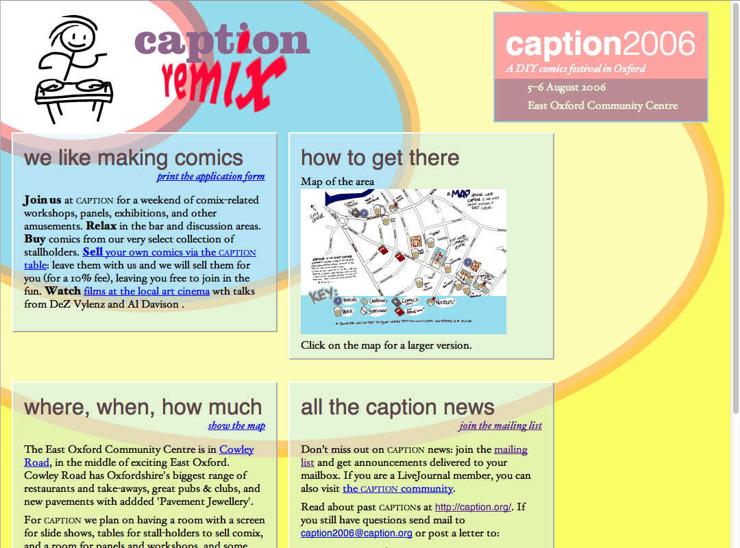
CAPTION 2006 was CAPTION Remix (in honour of our new remixed committee). In those days, to get the effect of a translucent background, you created a fainter version of your original background and used that as the background of the translucent boxes. (For an explantion, see Eric Meyer’s Complexspiral demo.)
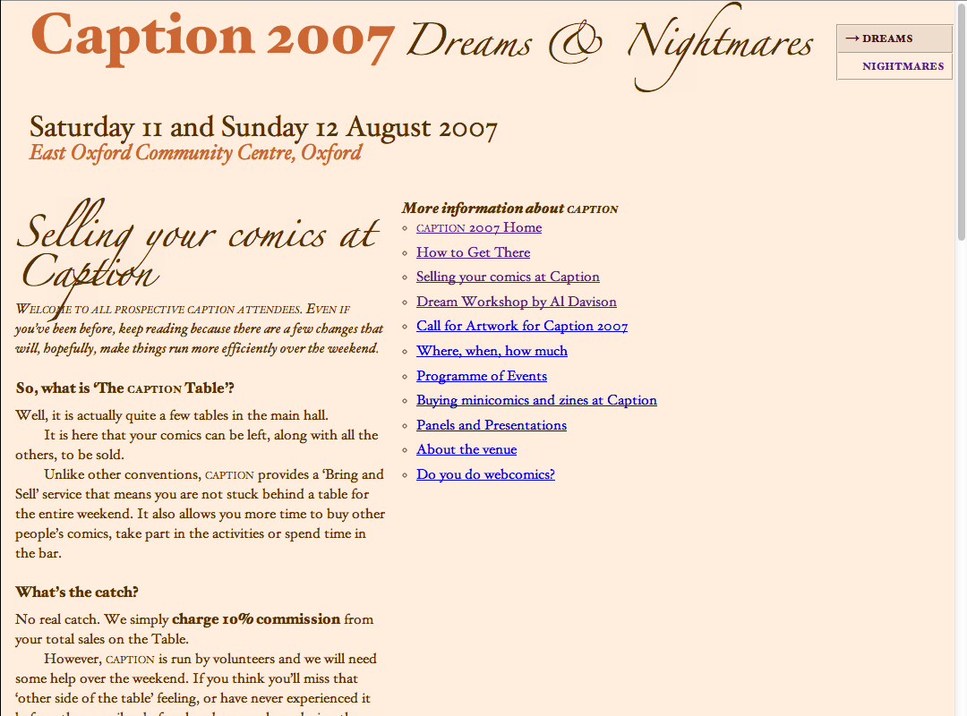
The theme for CAPTION 2007 was Dreams and Nightmares, so I created two styles for the site that year, one dreamy and one nightmarish. These rather blatantly work best only on systems with the full Macintosh repertoire of fonts (this being in the days before webfonts were reinvented).
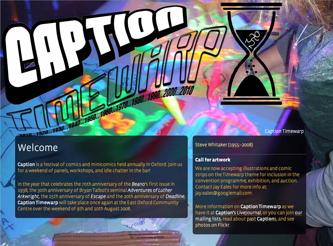
For ‘Timewarp’ CAPTION 2008 I was basing the design partly on a logo created by Jay Eales and Selina Lock. The psychedlic background is actually a photo I took of an art workshop by Deidre Ruane using blacklight and fluourescent paints.
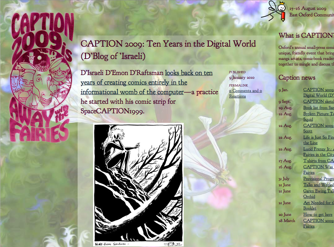
For CAPTION 2009 and the next three I am cheating a bit here. For 2009 I felt too burned-out to write the whole web site myself—previous years’s sites had gotten more and more terse—so I set up a Drupal system and created a pleasent-enough pastel theme and hoped the committee would do most of the writing for me. In 2012 I took on the web site chores again and built a new system with Django. I extracted the articles for CAPTIONs 2009–2011 from the SQL dump of the database and injected them in to the new site, and created new templates for them. For the ‘Away with the Fairies’ look I have used Terry Wiley’s tee-shirt design as the main logo, woth my sitck-figure fairy as a decoration at the top. The backdrop is a phot from my garden, with the swirls drawn with the smudge tool in an attempt to make a tileable image.
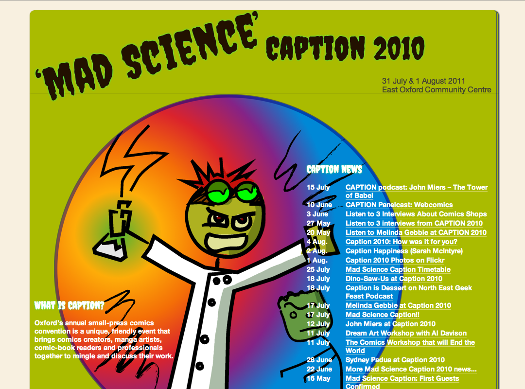
For ‘Mad Science’ CAPTION 2010 I tried for the look of a pulp sf magazine, using the stick-figure mad scientist I drew for the flyer as the main image. This one probably shows the combination of pre- and post-convention articles because there are a lot of articles linking to podcasts made at CAPTION 2010 and published later.
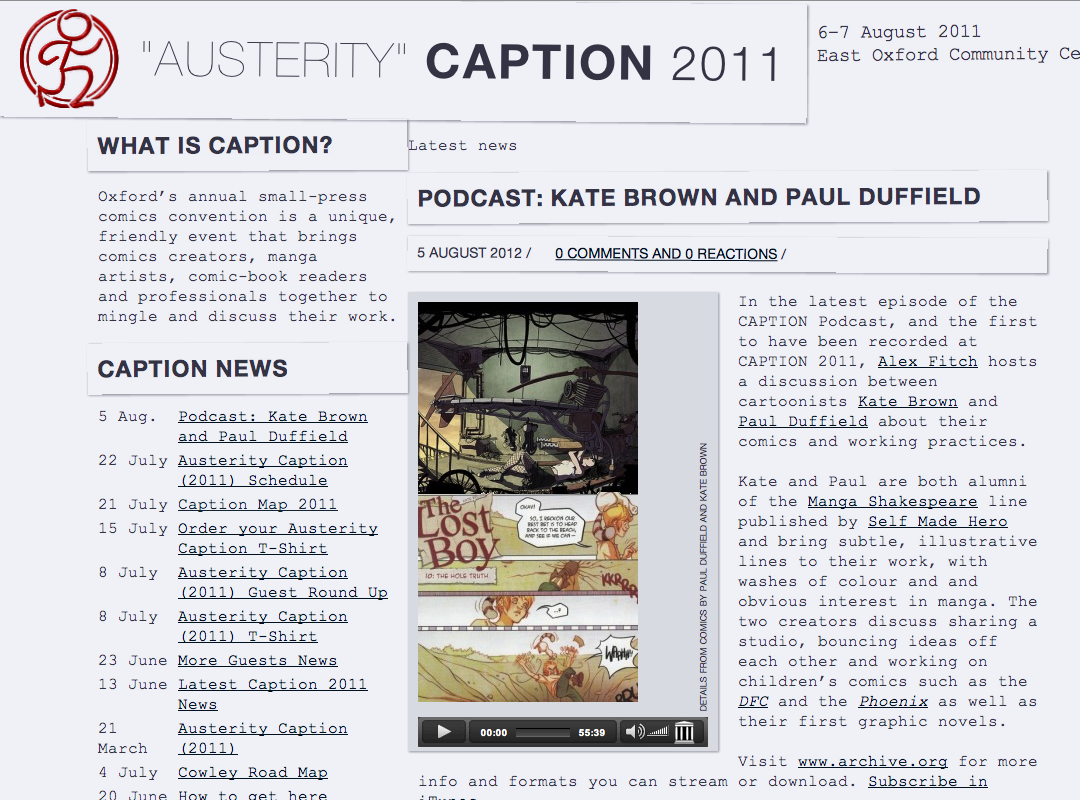
The last past site, CAPTION 2011 was ‘Austerity CAPTION’. My take on this was to try to imitate the typewritten zines of yesteryear, using actual Courier New. Headlines are supposed to represent Helvetica typeset separately and pasted on to the page, represented by the shadows and tilting. I turned the CAPTION stick-figure logo in to a fake stamp.
I have knocked together a simple slideshow which should work adequately in most browsers. Some older versions of IE might have troiuble with showing negative margins correctly; apologies if this affects you. Without JavaScript it should just turn in to a long article with images in it.