By February 2012 the company website for Optimor, http://optimorlabs.com/ had not been updated since 2008. You can see the old version of the site in the Internet Wayback Machine. Amongst other problems, the ‘latest news’ article was about billmonitor’s launch a few years ago and used the old capitalization of the name. There was no budget to get a designer in to update it, so I took it on myself.
This is what I came up with:
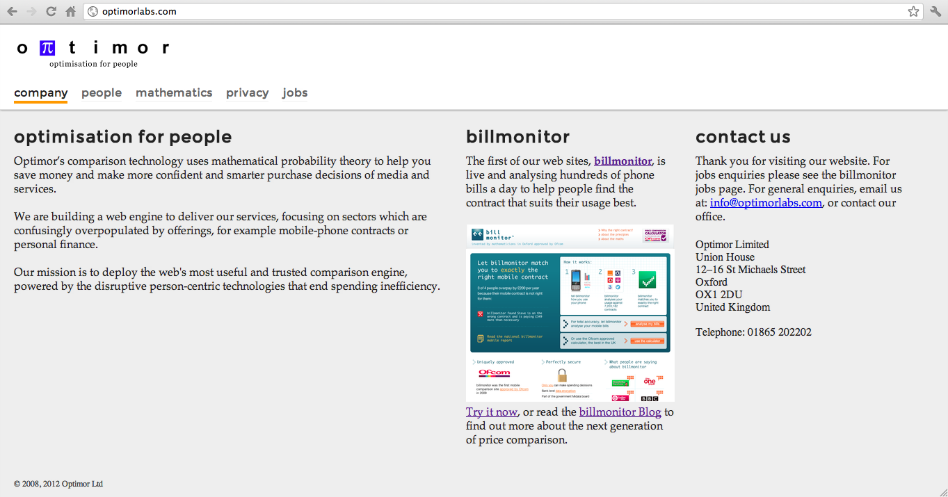
(Click for full-size screen shot.)
The old site was in an obsolete version of Ruby on Rails. I redid it from scratch in static HTML and CSS: for a brochure site this small it is the simplest solution. I was aiming for a simple, ‘no-design’ design to suit our run-by-mathematicians story, but nevertheless a little more professional-looking than before.
Layout
The simple gird is designed to spread across a widescreen displays and switch to a vertical layout on a 768px-wide iPad-style screen.
The body typeface is Palatino (called Book Antiqua on Windows) as a nod to my University days, when Palatino was a popular choice for academic papers.
Navigation
I streamlined the navigation, merging the history of probability and the mathematics page, and collecting company, contact, and overview information on the front page.
I also moved the Privacy link out of the footer and in to the main navigation bar, on the grounds that privacy and how we handle users’ personal data is so central to the company’s operation. The aim was to make our privacy policy something we brag about rather than fine print hidden in the page footer.
Benefits
Given the time constraints I think it is a decent face-lift of the corporate site.