One of the principles I am following with Kanbo is that it is not intended to replace your existing task tracker, assuming you have one. Instead the plan is to extract just enough information to display the task board with draggable cards and leave task descriptions, comments, risk assessments, estimates, etc., to your existing tracker. For this to work we need to be able to link to the othe tracker.
I have added an HREF field to the cards. This will be used as the link to the other tracker (I am assuming your other tracker is a web application). This gave me the problem that there are now two obvious things to do when the user clicks on a card:
- show the details or editing page for the card; or
- show the page the card is linked to.
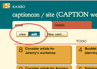
 After scratching my head about this for a bit I came up with a user interface using one of the oldest metaphors in the windowing world: the MacPaint toolbox. The idea is that the highlighted item in the toolbox tells you what effect poking the board with the mouse will have. This illustration shows a temporary user interface—I need to replace the words with pictures and arrange for different cursors if I am to make this work like the real thing.
I worry a little that this is (for want of a better phrase) a second-degree metaphor: it is a web user interface designed to remind you of a metaphor used in desktop application. Normally I have very little patience with web pages aping desktop interfaces with fake window frames that don’t really work and pretend spreadsheet grids that use megabytes of JavaScript to almost but not quite resemble the real thing. The problem being that it only works for people coming to the web from Microsoft Office; for young folks who read the web via their Xbox or phone or pad, this UI is worse than useless because it discards web conventions they are familar with in favour of PC conventions they may not have seen. Is the toolbox obvious enough to someone unused to desktop applications?
The first stab at implementing this is also a little clunky: it reloads the page with the links changed to a different URL. The next step will be some ‘unobtrusive’ JavaScript to change the buttons used to switch tools so that they change the links on the current page in place, eliminating the page reload. The page-reload code will remain just in case you are not using JavaScript.
There is still a long way to go to meet the Kanbo vision, but this takes it one step nearer …