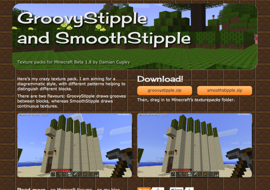
OK so I finally decided to resolve my confusion as to where on my site to put my Minecraft texture packs by creating a dedicated GroovyStipple and SmoothStipple mini site. Bascially it is a brochure with two download links. Here’s what went in to it.

HTML and CSS
There are no interactive features so the HTML, CSS, and graphics are all just files. I edited the HTML and CSS with jEdit, my current default text editor—with this simple a site there was no point using anything fancier. The graphics are mostly screenshots from the game.
Design
Dirt background
It is practically the law that any web site relating to Minecraft uses the dirt texture as the background—and of course in this case it is the dirt texture from my packs. Rather than just blowing it up, I expanded it using the Scale2x algorithm. I like the way it comes out—neither fuzzy nor blocky. Here’s what Acorn’s default resizing algorithm, scale2x (applied twice), and pixel-by-pixel enlargement look like:

(These images all started with a 16 × 16 image expanded to 64 × 64 and then doubled in size to show off the pixels better.)
Typography
With a dark background you can either go for light text on dark or place your text in light-coloured boxes floating over the ground. I used the latter for Texturejam, so I thought I would use light-on-dark this time around. It needs bigger, bolder type to be readable on a textured backdrop, which is OK because I am keeping the amount of text on the page to a minimum.
The font for the title is Cherry Cream Soda by Font Diner. I am using the version hosted by Google so that keeping up with browser support is their problem, not mine.
Layout
The basis of the layout is a grid in the style of 960.gs, though I
do not use their readymade CSS and JavaScript, just the convention of
80-pixel horizontal units, with 20-pixel gutters. Mostly this works by
having layout section or div elements with widths that are multiples
of 80px, and the content elements like p and li having 10px
horizontal margins.
section {
    width: 480px;
    float: left;
    margin: 10px 0;
}

section p {
    margin: 0.613em 10px;
}
The items on the page are mostly boxes of a given size and the layout is
mostly achieved through CSS floats—the body element acting as a
correct-sized bucket in to which the units are poured.
The size of the body varies according to the available width, using the magic of CSS media queries
(here is a randomly selected tutorial).

The sizes used are 720, 960, 1200, and 1440px (or 9, 12, 15, or 18 units). The smallest size should suit a 768 × 1024 screen like an iPad, the 18-unit design looks OK on my 1680 × 1050 monitor. Some of the items on the page change their width and positioning as well to try to make an acceptable layout.
The point of the grid is to have a layout where there are enough things aligned with other things to make it look tidy instead of just a mess. The biggest risk–especially for the likes of me—is that you end up with a kind of TV dinner effect of boxes arranged in a boxy pattern. The problem with this page is the two screenshots directly underneath the banner picture. I may have to come up with a different solution to that part of the page.
One more thing: some of the older screenshots vary slightly in height, which caused the float-wrapping approach to create unslightly gaps. I fixed this with jQuery Masonry.
Domain, DNS, and Hosting
Getting a domain is pretty easy once you know how. As a .me.uk domain.
stipple.me.uk cost £6 for two years from Gandi (a registrar I chose based
on a mention on some discussion and their being based in the EU). Gandi also
supply the DNS server that lets web browsers translate stipple.me.uk in to the
IP address of my server at Linode in London.
There are no interactive features so all the web server needs to do is serve the HTML, CSS, and graphics files. With Nginx the settings for static sites are straightforward:
server {
    listen 80;
    server_name  stipple.me.uk;
    access_log  /var/log/nginx/stipple.access.log  main;
    error_log /var/log/nginx/stipple.error.log info;

    location / {
        root /home/stipple/Sites/stipple;
    }
}
—plus another clause to redirect www.stipple.me.uk to stipple.me.uk. Even
though there is no interaction I am following my convention of giving each site
its own user account and home directory.
Deployment
There are a few files that are derived from other files, so it makes
sense to keep them up to date using make. Here’s an exerpt from the
Makefile:
…
all: $(zip_files) site/favicon.ico site/sty/favicon.png

clean:
        rm -f $(zip_files)  site/favicon.ico site/sty/favicon.png

deploy: all
        rsync -avuzb -e ssh --exclude '*~' \
            site/ stipple@spreadsite.org:Sites/stipple
…
After months at work spent using rake, fab, and knife
incantations, it is nice that I can do a deploy by typing a simple make deploy.
Buttons
Social-media buttons have become something of a plague on web sites these days. I don’t want a mess of buttons, but I did want to add a bare minimum: Twitter and Flattr. Twitter because it really is more convenient to have the address shortened for you, and Flattr because I really would like its model of micropayments for content to be better known.
The Flattr concept is like the FaceBook ‘like’ button, except that when you click it you hand over a small quantity of money rather than a tiny sliver of your soul. The difference between Flattr and other micropayment systems is that you decide ahead of time how much money you are willing to put in to supporting the arts online, and the amount paid per click is calculated accordingly. I don’t expect to make serious money from the Flattr button on a site this obscure.
That’s All
And so it is my silly texture packs GroovyStipple and SmoothStipple have their own special place on the Web.