My new hobby is building a computer keyboard (see previous article for more about building keyboards in general).
The pay-off for building your own is you get to make something not normally available off the shelf. What do I hope to make my new keyboard like?
Aesthetics
I generally prefer key caps with spherical tops (as opposed to the more conventional cylindrical top surface) and centred legends (rather than letters being printed in the top left corner of the cap).
I am more interested in colours that I can imagine fitting in calmly in to the a home office or sitting room, rather than looking like a prop from a science-fiction video game. But spherical caps are really only available as group buys, so I am choosing amongst the options available rather than specifying a custom colour scheme of my own.
To that end I have jumped on group buys for Q-Series SKIDATA and SA Dasher. Both of these colour-ways are inspired by keyboards of data terminals I have never heard of before, but that is neither here nor there. I don’t plan on styling my keyboard look like a SKIDATA terminal; the orange-on-black key caps should look fine paired with a case in some not-glossy black material (wood or acrylic is most likely)
The usual way to make a case by hand results in a rectangular slab. It would be possible to contrive a wedge-shaped case by making the sides separately, and conventionally keyboards have an upwards slope. Nevertheless for better ergonomics I plan to make a flat slab, and to make the slab as thin as possible, squeezing the necessary circuitry in to a minimum amount of space. If I want to add a slope later with little feet they will be easy to retrofit.
Layout
I prefer smaller keyboards, with the minimum number of keys needed to type the full ASCII repertoire without weird contortions (I don’t yet feel able to commit to retraining myself to use 40% layouts). The Mac UI allows me to do without the satellite clusters of numeric numpads and navigation keys. Omitting these—with the exception that I do want to have dedicated arrow keys—allows for a more compact design and reduces the amount you have to react to use the mouse. (For work I have a TKL because the Eclipse IDE needs more keys.)
I have opinions about keyboard layouts.

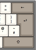
I prefer the ANSI style of
horizontal Return key as opposed to the vertical ISO style. I dislike the way the UK layout on PC keyboards has @ swapped with " and a odd combination of #~.

I don’t
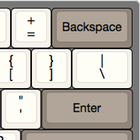
like it when an ordinary key (such as the \ | key)
is stretched to make the layout rectangular.
Splitting the left shift
key to squeeze in a key to the left of Z irks me, especially when it is
paired with a gigantic right shit key that I never use. The key to the left
of the 1 ! key should be Escape, and definitely not some random symbols
needed by no-one (§ ± on the Mac, ¬ on PCs). I prefer the bottom row
(with the space bar) to not be the full width, so the array of keys
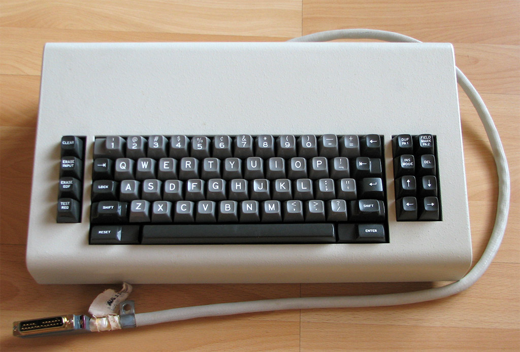
is not just a rectangular block. I rather like the look of old-timey
keyboards with the modifier keys sized according to importance without
being stretched in odd ways to make the overall shape a tidy rectangle.
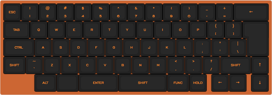
I have been fiddling with a Keyboard Layout for the first build, which I am going to call X1 until I think of a better name. This is what I have come up with so far:

I have two sets of caps on order so it seems like a good idea to make two different keyboards; for the SKIDATA set I am planning on a 60% layout with an ISO return key. It started out weirder, but after a lot of iterations this has ended up increasingly similar to Apple UK layout. The main remaining oddity is the split spacebar bodged out of the 2¼-unit-wide Enter key and 2¾-unit right shift key. The left half of the spacebar might become a super-large ⌘ key on the Mac.
The biggest compromise is fitting in the arrow keys: I have ended up with an L-shaped rather than T-shaped arrow cluster. We will see how badly this annoys me in the fullness of time.
Other features
I don’t feel any need for backlit keys, let alone the elaborate individually addressable RGB LEDS in each key. (Obviously if I suffer a moment of weakness and order a set of LightCycle Key caps it will be necessary to include a translucent blue slice in the case design and some internal lighting to give it a glow. But that is a special case.)
One thing that an Apple wired keyboard has that might be nice to replicate, if it is easy, is a USB hub in the keyboard. This allows your mouse to be plugged in to the keyboard and only a single cable needs to snake back to the computer proper. This is most useful with computers with a CPU module that sits under your desk, or course, but with Apple getting more parsimonious with ports on newer laptops it might be useful for them as well.
Next
The biggest bit of planning remaining is how to cut, build, fabricate or otherwise concoct the top plate.
