I built a Zlant, an eccentric staggered 40% mechanical keyboard.
Background
One of my odd hobbies is mechanical keyboards. Let me explain.
Just to be clear, by keyboard I mean a computer keyboard: the thing you have built in to your laptop or magnetically attached to your iPad. Since the late 1980s these mostly work by having the keys press in to two rubbery membranes to make an electrical contact. This is cheap and quiet, but old-fashioned mechanical keyboards with individual switches containing tiny springs and metal clicky things are more fun. More fun because they feel different, and aficionados can whitter on for endless forum posts trying to describe the way different switches feel. More fun because since they are made from discrete components, they can be pulled apart and reassembled to make a keyboard with custom key caps (Amazing Chocolatier? MT3 /dev/tty?) or your choice of switches. There is a cottage industry in fancy keyboard cases sold sans switches or key caps so the buyer can select their own. Recently there has been a pre-Cambrian explosion in switch types beyond the half-dozen varieties commercially available last decade.

Part of the fun is that a keyboard is a fairly tractable electronics project, since switches are big clunky through-hole components that are easy to solder, and the circuit is not as complicated as all that. You can hand-wire the switches to a dinky little microcontroller, use one of several ready-made PCBs, or use free software to design your own PCB, uploading the design files to an on-line PCB prototyping service. Cases can be hand-built from wood, laser-cut from acrylic, milled from aluminium, or folded out of sheet metal. Obviously how much you customize and tweak will depend on how much time and money you want to sink in to a replacement for a £10 peripheral. Some of the luxury customs are beautiful but crazy expensive.
One axis of customizability is layout, which is broadly categorized by size. Some people like bigger keyboards on the grounds that more keys is obviously better because you can program the to do more things. Others like keyboards with a smaller footprint so as to free up desk space and improve the ergonomics of using a mouse, or on the grounds that for touch-typists the keys further from the home row require too much hand movement.
The terminology may seem a little odd at first. A full size keyboard is what used to be called an extended keyboard, with 103 or 104 keys in four blocks: alphanumerics with the f-key block above, nav cluster, and numpad. A TKL omits the numpad. A 75% reduces the numpad to a single column and smooshes the three blocks together in to one rectangle of many keys. A 65% drops the f-key row, and a 60% drops the navigation column, reducing it to the alphanumeric block from a full-sized. A lot of 65% designs lack dedicated arrow keys, requiring you to use chords to get cursor control, which is step too far for some. It is a fairly popular form factor for ready-made keyboards, with brands like Poker and Anne pro being quite popular.

The next size down is 40%, which loses the number row. This gives you an adorably tiny keyboard with no visible means of typing numbers or some quite important punctuation marks. The pay off for requiring so many more chord combinations is supposed to be the reduced finger travel (I am not a touch-typist, so I cannot speak to that). The most dramatic expression of this idea is the Planck keyboard, which is ortholinear as opposed to staggered: they keys are an 8×12 grid of 47 or 48 keys, all the same size apart from the double-width space bar in the 47-key version. Not staggering the rows in principle makes sense in terms of finger movement, but it can feel very awkward to someone coming from a conventional keyboard.
What is Zlant?
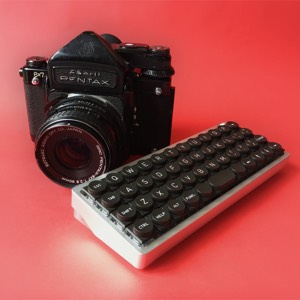
THe Zlant is a keyboard kit, designed and produced by Ziptyze and sold through 1up Keyboards. The layout is exactly that of a Planck, except skewed by a quarter-key per row (22.5°). It thus makes a rhombus instead of the usual rectangular shape. The stagger makes the layout a little more familiar to people coming from conventional keyboards (even though it is not exactly the same), and also makes it look slightly hilarious.
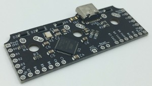
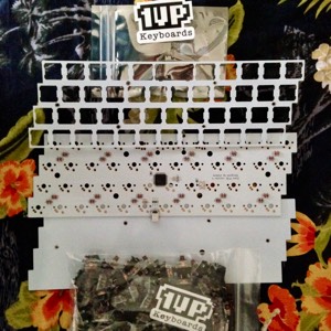
The kit is skeletal, resembling the OLKB ‘Easy on the Wallet’ (EOTW) style: no case, just the PCB and top and bottom plates themselves made of the same FR4 material as the PCB, together with the electronics, screws and stand-offs required. The key switches and key caps are bought separately.
There are designs for a high-profile case on Thingiverse, or you could pursue the dementedly maximalist case for this minimalist keyboard, the inimitable Keeblade by Qlavier.
Building a Zlant
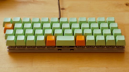
As it happens I had a Planck-style key-cap set: Retroist from UK Keycaps. This was an experimental group buy from a new old supplier Devlin, who used to make point-of-sale terminals and still had moulds for 1- and 2u keys. Lacking the other odd sizes it can’t be used for normal keyboards, but it suits ortholinear keyboards. It was intended to be white on dark green but due to what amounts to a printing error the caps are white on mint green. A slightly quirky keyset deserves a slightly quirky keyboard, so when I found the Zlant still for sale I sent off for a kit.

The package comes in a surprisingly small box complete with a few stickers, which is nice. The Oxford Hackspace being long closed I couldn’t use their solder station, so I stuck some switches on and screwed the bits together into a keyboard-shaped object to admire while I procrastinated on buying a soldering iron. The big delay was trying to work out which model to choose; the breakthrough was discovering Hobbytronics have exactly one model on sale. Tyranny of choice defeated!
The actual soldering is pretty simple since you only need to solder in the key switches, the diodes and microprocecssor and other appurtenances already being soldered to the board. I did it one morning on my patio table for the sake of maximum ventilation.
Typing on a Zlant
The keyboard is really quite adorable.

The plates and PCB are trimmed to the exact outline of the keys, so it has the smallest possible footprint. The Retroist key caps are tall, squarish, spherical profile, which brings out the grid nature of the layout. I used Gateron Brown switches, a ‘silent’ tactile switch, which is not completely silent and not particularly tactile (though more so than the Cherry equivalent). The unusually thick and tall caps make a fairly mellow sound as a pound away on them. There are only two issues.
The first, of course, is adapting to the 40% layout. There are extra modifier
keys Lower and Raise flanking the space bar, and to get a ‘1’ I need to type
Raise + Q, for example. The keys not having side-printed legends or anything,
one must just memorize the positions. So far I can more or less type things
but I need to concentrate, and the are occasional pauses as I try to remember
an obscure combo. Some punctuation is doubly obscure: to get an apostrophe on
an Apple system you type Alt + Shift + ], and ] is Lower + ; , so ’ is
Shift + Alt + Lower + ; .
The one thing that perhaps unexpectedly does not cause difficulty is the tiny space bar—just 2 u wide rather than the conventional 6.25 u or 7 u. I was taught to hit space with my right thumb (the only aspect of touch-typing that actually stuck), and the key falls neatly under where my thumb naturally sits.
The second thing is the white on mint colour scheme. It’s pretty and has a nice retro vibe, but in dim light is it is a little tricky seeing which key is which. It is not really that much of an issue though, unless I get excited about typing something complicated before breakfast.