For my own reference as much as anyone’s, here is the changes I made to make Morseless, the world’s most trivial web app, in to an iOS app.

Magical Viewport Tag
When Safari for iOS shows a web page it scales it on the assumption it is
supposed to be 960px wide. This means that it is not enough to just add CSS media
queries to adjust the layout. You also have to add the following meta
tag to your HTML page:
<meta name="viewport" content="initial-scale=1, maximum-scale=1" />
This means the viewport will be 320px wide on an iPhone (whether Retina display or not) or 480px when turned sideways. Other phones with similar-sized screens will generally apply a scaling factor that displays your page at a similar physical size. (Which means that 1px might be 1, 1·5, or 2 actual physical pixels—but you already knew that.)
This also limits the ability of the user to scale the page, so you better make sure the layout is readable at that scale.
Responsive Design
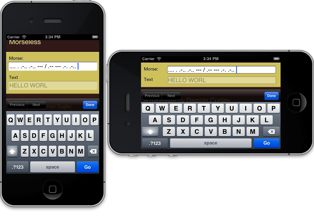
Depending on how your app is laid out you might use JavaSscript or CSS to adjust for the phone screen. In the case of Moresless I added some media- query-guarded HTML to simplify the layout and reduce the size of the header. The form switches from being in a box floating in the middle of the page to a band stretching from side to side.
In the 320px layout, labels go above form items to give as much space for the text fields as posible. In the 480px layout, labels remain to the left of text fields, because vertical space is very precious in landscape mode with the keyboard deployed.
Testing on an Imaginary iPhone 5
You can use the iOS simulator that is part of Xcode to try out the design on a simulated iPhone (with Retina display and not) and iPad.
It seems the correct way to start the simulator up is to start Xcode and then invoke the simulator from the Application menu. The hilarious thing is how the Retina iPhone is the full height of my desktop monitor.
Icons for Appificiation
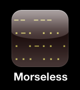
Both Android and iOS allow you to turn a web page in to an app on your home
screen. By default the icon is made by scaling down the page, which does not
often look like much. Instead you can supply an image to use for the icon, in
a similar fashion to the shortcut icon (= favicon) meta tag.
Here it is from my template:
    <link rel="apple-touch-icon"
        href="{% static 'style/apple-touch-icon-57x57.png' %}" />
    <link rel="apple-touch-icon" sizes="114x114"
        href="{% static 'style/apple-touch-icon-114x114.png' %}" />
The icon in this case is super simple, so easy to scale to different sizes. The iPhone automatically creates applies the shiny effects and crops it to a rounded rectangle.
This particular app does need any navigation, so we can tell iOS it is OK to suppress the address bar:
<meta name="apple-mobile-web-app-capable" content="yes" />
This is another of Apple’s nonstandard meta tags.
Summary
Main steps for this app were
- Viewport tag
- Responsive CSS to make phone layout
- (Optional) Links to icon images
- Check the interaction does not depend on non-touch events like mouseovers.
The second and fourth steps are the ones that will require serious effort in a nontrivial application.