There comes a point when you begin to think that titles of books, programmes, and movies are more structured than just a sequence of words. This point is where you are looking at a menu of episodes or titles in a series and cannot tell one from the other because they have all been abbreviated to a common prefix.
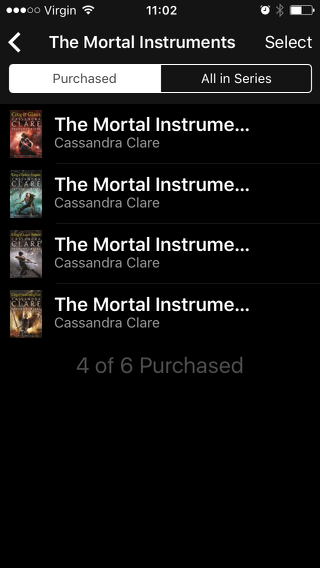
Here is a recent example. These are four of the books in the Mortal Instruments series. The first item in the list should be labelled ‘Book 3. City of Glass’, since the series designation is common to all of them, or even just ‘3. City of Glass’ since the books’ being books is implied by the fact that this is a list of books in an app called iBooks. Instead it is labelled ‘The Mortal Instrume…’, which is useless.
Apart from the long common prefix there is the problem that the mobile layout is trying so hard to look like lists do on larger screens that the title is truncated instead of wrapped over more than one line. There is a lump of black space at the bottom of this screenshot not being used to display information so it is not as if the truncation was required in order to fit more books on the screen.
I don’t want to specifically pick on iBooks here; I have seen the same problem on other content-listing apps and sites. I assume that the designs are signed off with mock-ups showing programs or episodes or books with titles that make the mock-up look good, rather than as episodes of series. I have found myself looking at a screen-full of ‘The Lord Peter Wimsey Mys…’ or ’Doctor Who: The Classic Series: Doctor Wh…’, trying to work out which one is the episode after the one I have just listened to or watched. There is no need for this!
